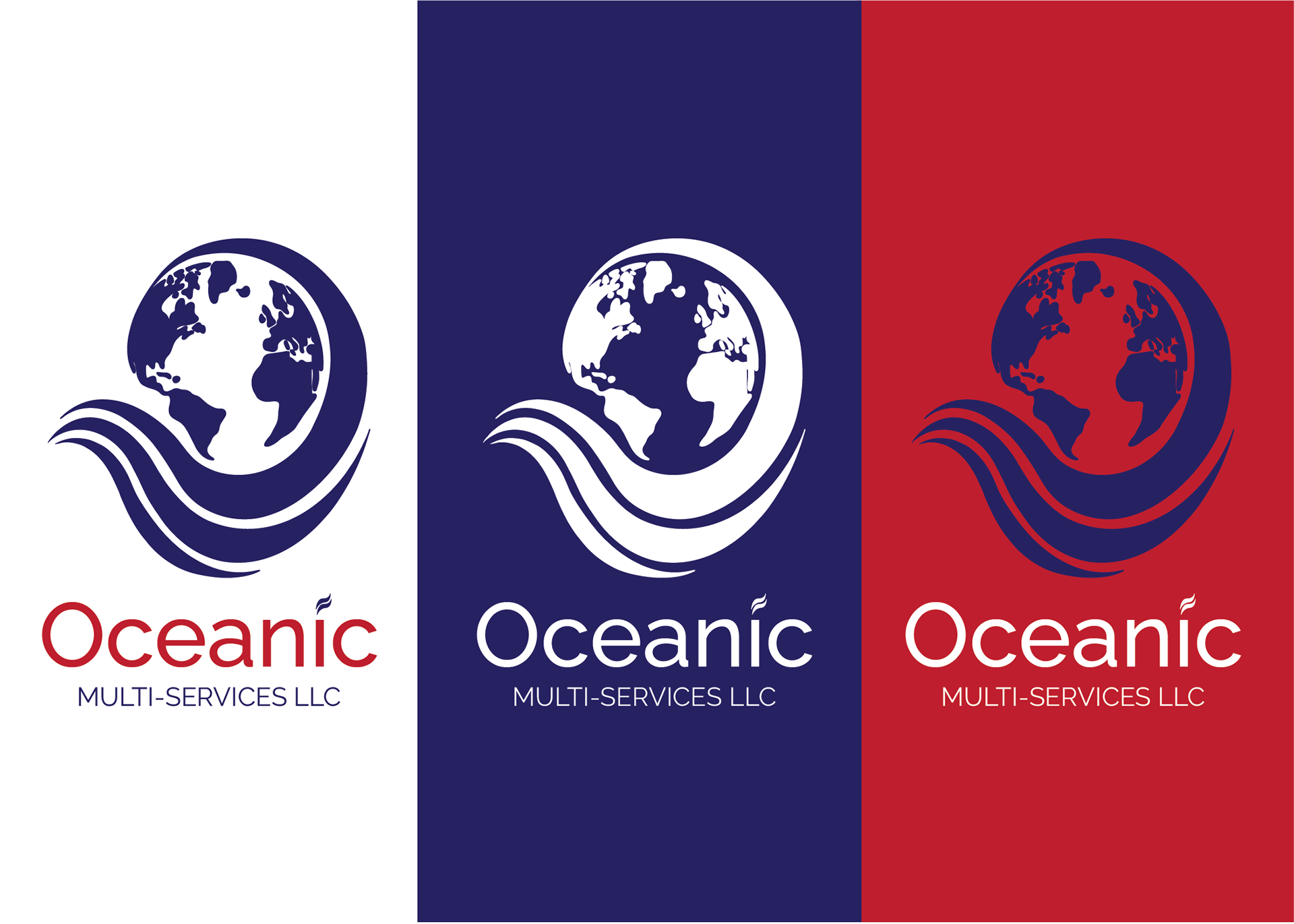
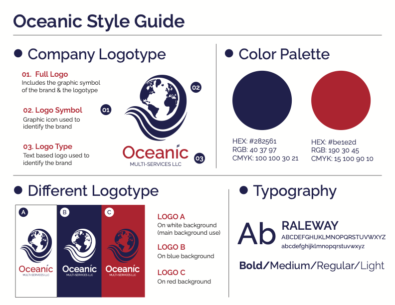
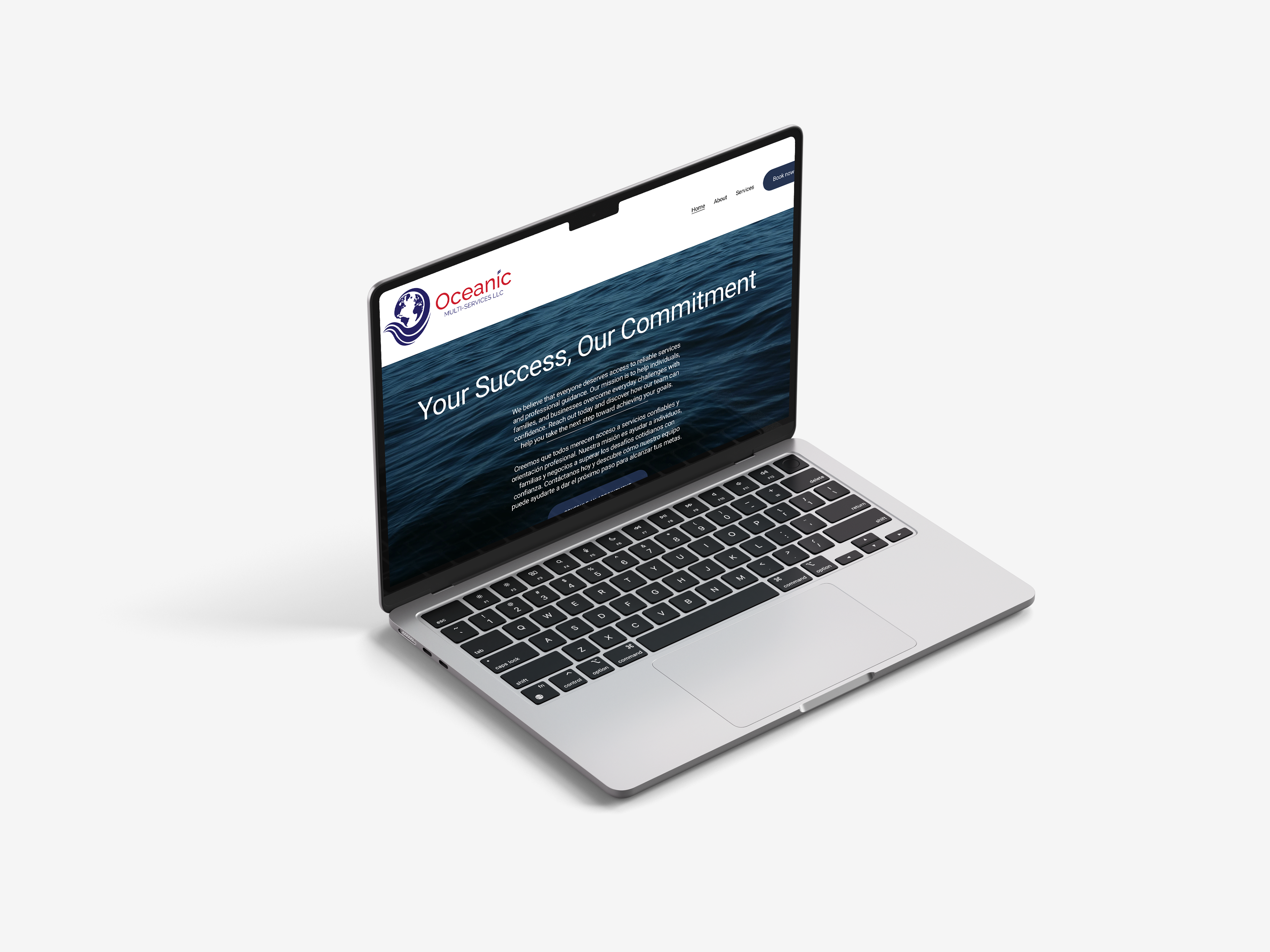

For this project, I had the opportunity to redesign an existing brand for a client who wanted to modernize their company’s identity with a cleaner, more contemporary visual direction. I developed a versatile logo that communicates the company’s ability to support people with a wide range of needs while creating a stronger and more cohesive brand presence.The central earth element represents the company’s diverse range of services, while the surrounding wave symbolizes its commitment to helping and supporting others. The wave’s expansive form reflects the company’s ability to reach and assist people from different backgrounds and with different needs. Through this redesign, I was able to create a more refined and adaptable visual identity that better represents the company’s growing services and forward-thinking approach.